This page chronicles the final project for my GIS and Mapping class taken in Winter of 2024. I wanted to creatively visualize both the success of all major pro sports franchises in the United States and the geography of where these franchises are located.
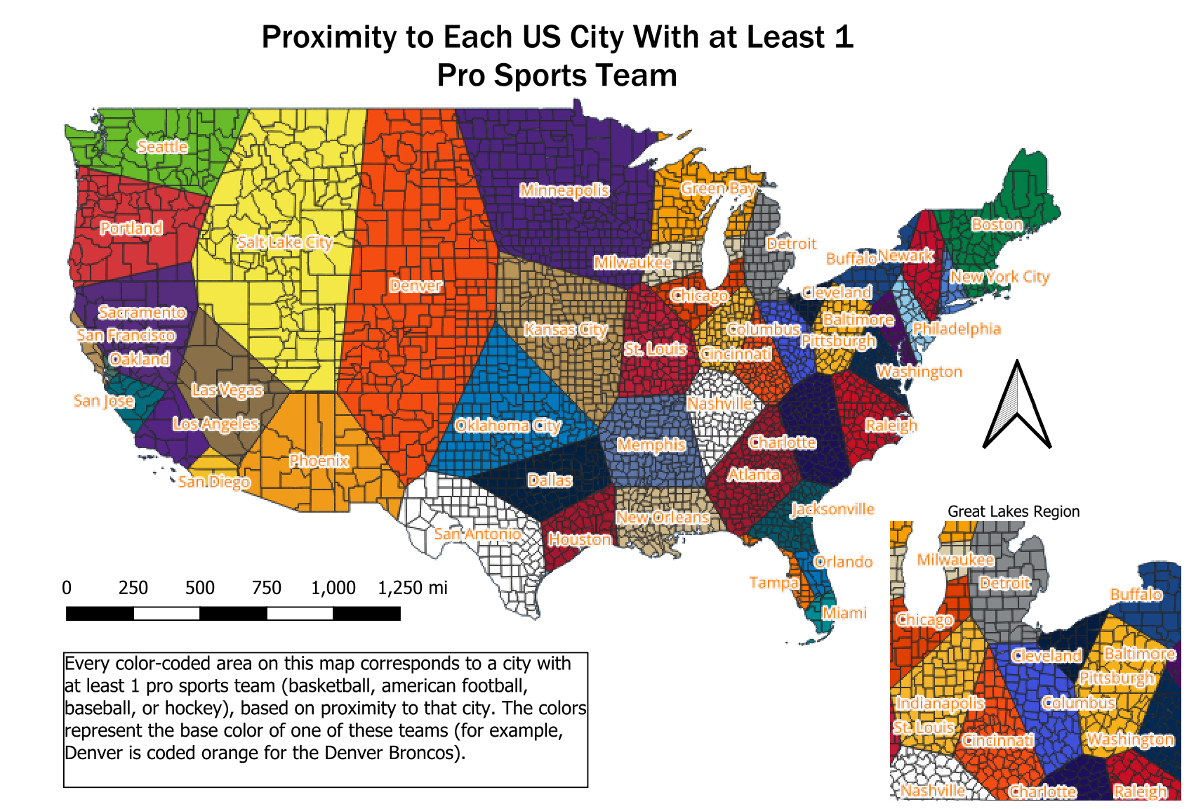
To the right is the first map I created that shows the relative proximity to each sports city. For example, the green area around Boston represents all the land area that is closer to that city than any other on the map. The colors chosen for each area are the primary colors of the logo for one of the cities' sports teams as of the 2023-24 season.

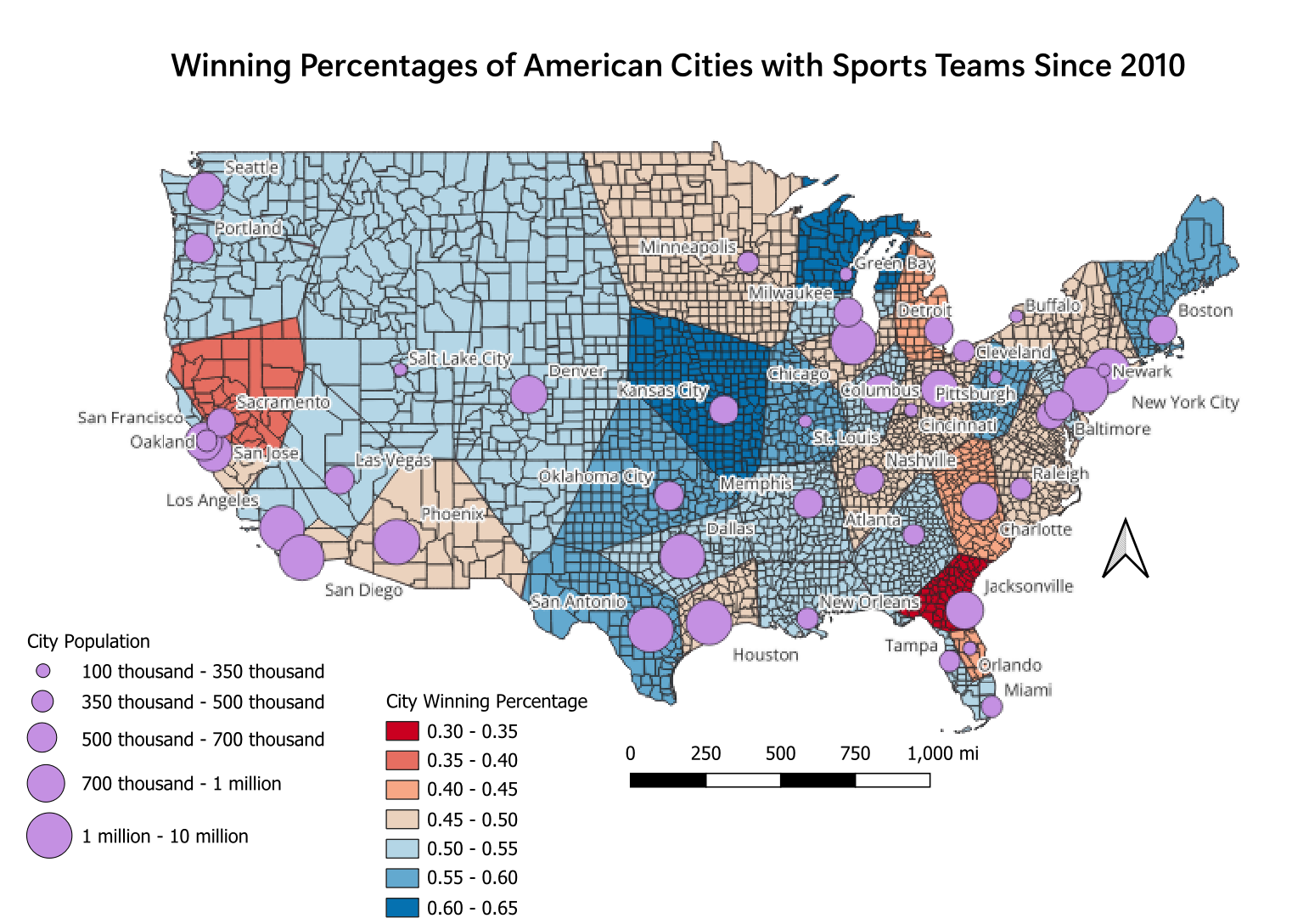
For my next map, I decided to color-code each area based on the combined winning percentage of each city since 2010, while also overlaying population information. Cities that are coded in blue have sports teams that win more than they lose, while cities coded in red lose more than they win. The deeper the shade of blue or red, the better or worse that city performs, respectively.
Notice that a high metro population does not equate to team success. Large cities such as Phoenix and Houston have underperformed, while small market hubs like Green Bay and Kansas City have teams that win frequently.

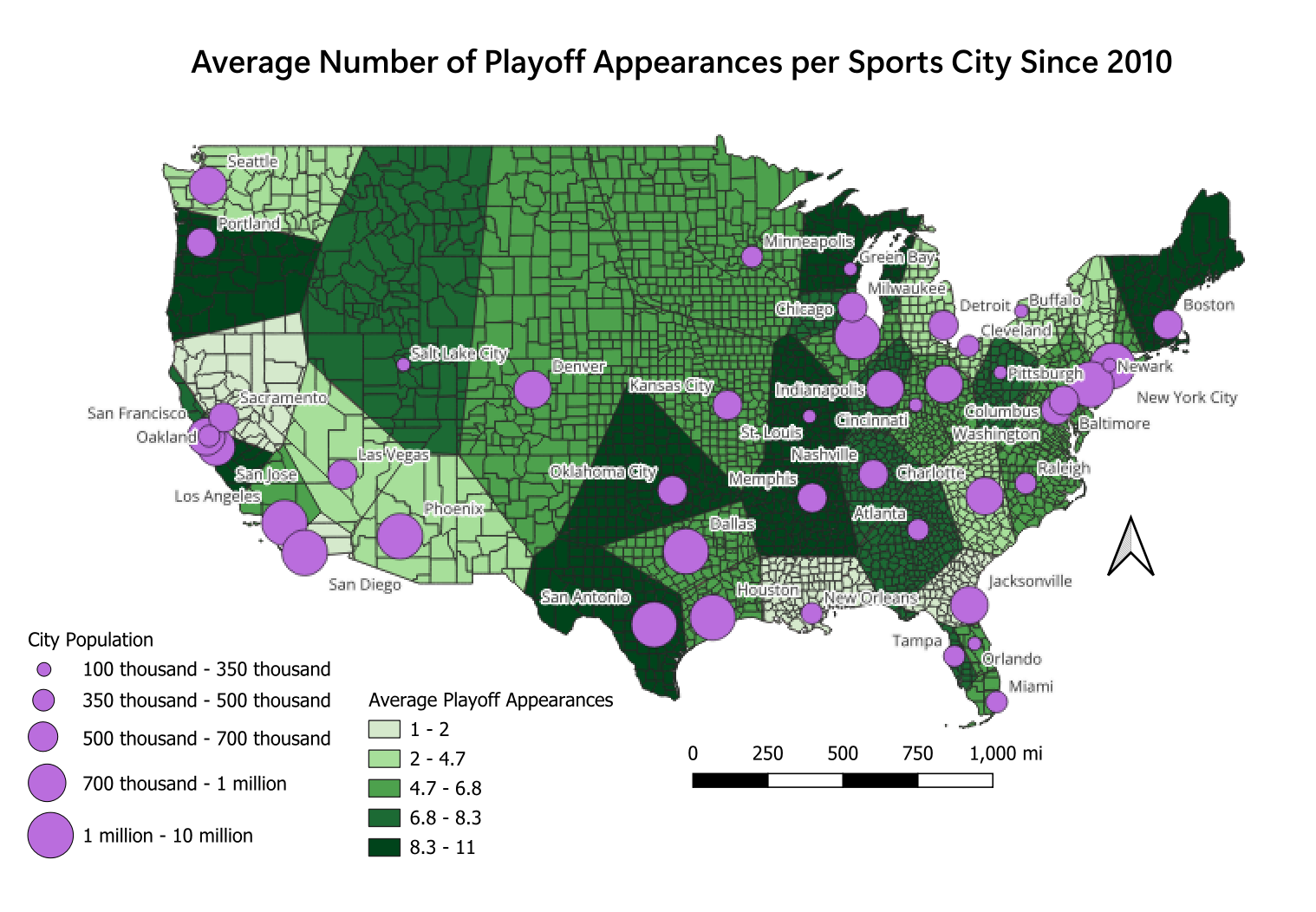
While overall winning percentage can be good for analyzing team success, any sports fan will tell you that what really matters is playoff success. With this in mind, this final map shows the average number of playoff appearances per team per city since 2010.
This map shows that some cities make the playoffs more or less frequently than their winning percentage might indicate compared to other cities. Boston, a city with all 4 major sports, has an impressive average of over 10 playoff appearances per team. Kansas City, on the other hand, had the highest combined winning percentage, but doesn't stand out as much in playoff success.
